CL ARTDROP

Overview:
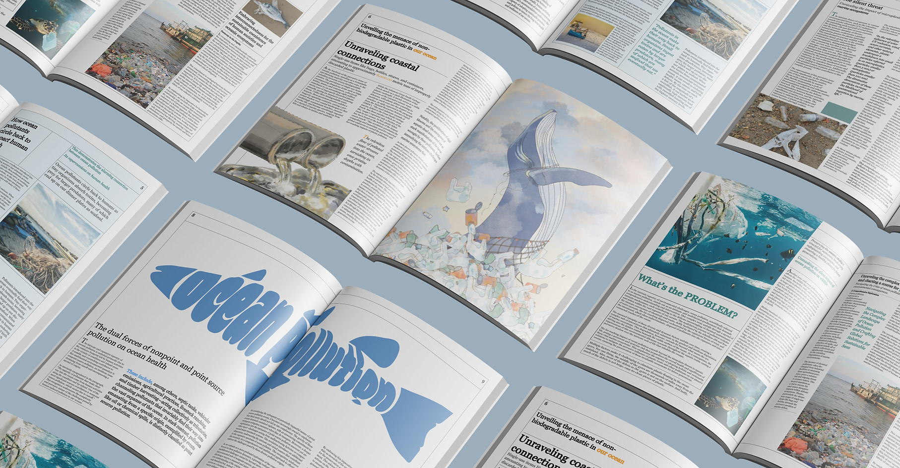
For my project, I dove deep into the critical problem of ocean pollution. I researched every aspect of this topic to better understand it. Subsequently, I applied my findings to recreate a magazine, opting for The Guardian's impactful platform.
The Guardian Weekly:
Ocean Pollution
Year: Fall2023
Role: Illustration, Layout, Visual
Tool: Adobe InDesign, Adobe Illustrator, Procreate

Challenge
Thorough research was conducted to dissect the distinctive features of "The Guardian" magazine covers. Attention was devoted to understanding the layout, typography, color palette, and unique design elements that characterize the publication.
Solution
Analyzing The Guardian’s design style, I applied its key visual elements—such as bold typography, structured layouts, and a muted color palette—to my cover redesign. This allowed me to maintain the magazine’s authentic voice while effectively presenting the issue of ocean pollution in a visually compelling and editorially consistent way.
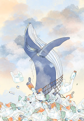
Illustration
a custom illustration for this project to visually represent the chosen theme and enhance the overall campaign design.


Typography
The words “Ocean Pollution” are drawn so that each letter doubles as a contour line of the fish. Curved strokes form the body and tail, while sharper angles define fins, allowing the text to create the silhouette without separate outlines.

Reflection
This project pushed me to merge research, illustration, and editorial design into a cohesive story. Translating dense data on ocean pollution into a fish‑shaped typographic graphic forced me to balance clarity with creativity. Every curve had to read as a letter and a recognizable animal silhouette. Re‑creating The Guardian’s visual language also sharpened my eye for grid systems, hierarchy, and restrained color palettes. The biggest takeaway was how design choices—stroke weight, texture, and negative space—can reinforce a message’s emotional weight without adding extra copy. If I revisit the project, I will experiment with motion graphics to animate debris drifting through the letterforms, extending the concept into interactive media and deepening audience engagement.